New This Week: See Exactly How Every Charger in Your Fleet Is Performing
Starting this week, every Anvil Monitor customer gets a new view into their charging infrastructure: Charger Utilization. It's a feature we built because the question we kept hearing from fleet managers wasn't "how much energy are we using," it was "which chargers are actually working for us, and which ones are sitting idle or jammed up." Now there's a direct answer.
Forklifts don't charge like passenger EVs
Most people's mental model of EV charging comes from their own car: plug in once overnight, unplug once in the morning. Industrial forklifts don't work that way. Drivers rely on opportunity charging, plugging in for 15 minutes during a break, a lunch, or a shift change, then getting back on the floor. Charger Utilization tracks how consistently that's actually happening. When utilization during those windows runs low, it's often an early signal of a workflow bottleneck or an operator habit that's letting batteries run deeper into a shift than they should, which is exactly the kind of thing that's easy to miss until it shows up as a mid-shift power failure.
Finding the bottleneck before it costs you a shift
The tool also shows whether specific charging stations are overloaded while others nearby sit unused. In a busy distribution center, a charger running consistently hotter than its neighbors can mean drivers are burning time navigating to the only open port, or it can mean that zone simply doesn't have enough chargers for how many trucks run through it. Either way, that's a fixable infrastructure problem, and now it's a visible one instead of something you find out about after equipment goes down.
Every kilowatt-hour, tracked toward revenue
Here's the part that connects directly to what Anvil Monitor already does best: throughput. Charger Utilization tracks the total kWh passing through every charger, and that's the exact data foundation clean fuel credit monetization runs on. Higher, more predictable energy throughput is verifiable clean-fuel generation, and verifiable generation is what turns into credit revenue under the programs Anvil Monitor already tracks for you. Utilization data doesn't just help you run a tighter floor, it's a real-time look at the throughput driving your payout.
No more chargers tied up by full batteries
The tool also correlates active charging time against a battery's actual state of charge, so it's easy to spot chargers being occupied by batteries that are already topped off. That kind of "dwell time" is a quiet productivity drain: a port sits full and unavailable right when a low truck needs it. Surfacing it means infrastructure stays ready for the next truck that actually needs a charge, not the one that's just parked.
What it looks like
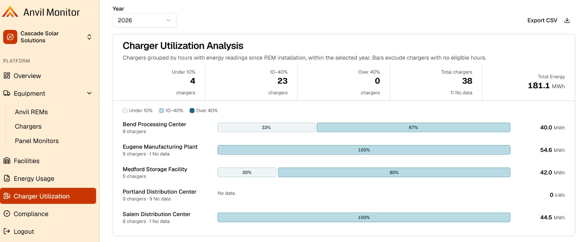
The new dashboard view breaks utilization down by facility, grouping chargers by utilization (under 10%, 10–40%, or over 40%) alongside your total charger count and total energy delivered, so you can see at a glance where the floor is running lean and where it's running hot.
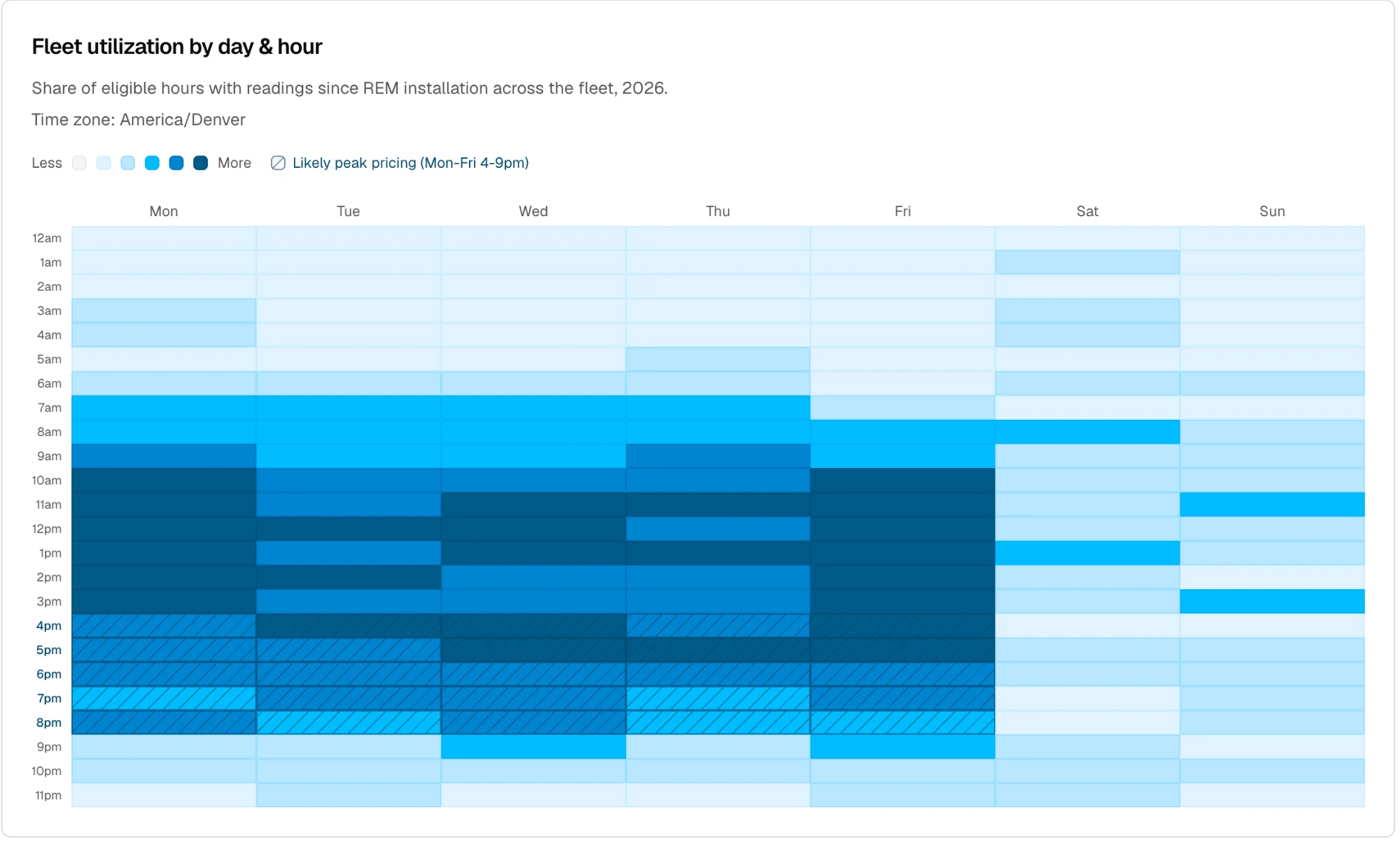
A day-and-hour heatmap underneath shows the pattern across a full week, including an overlay for likely peak-pricing hours, so it's easy to see exactly when the floor's opportunity-charging windows are landing and how consistently drivers are using them.
It's live this week
Charger Utilization is rolling out to Anvil Monitor accounts this week at no extra cost. If you're already running our Remote Energy Monitor, look for the new view in your dashboard. If you're not yet a customer and want to see what this looks like for your own fleet, get a free estimate or reach out and we'll walk you through it.